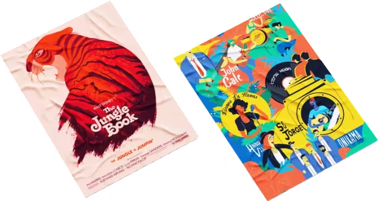
Have you ever seen a poster on the street that made you stop in your tracks? Maybe it was a concert promotion banner or a movie release teaser. You must remember what made you stop. Maybe it was the burst of colours, or the text was too attractive for you to just walk past without appreciating it.
You get home, and you keep thinking about it and the message it conveyed. Now, you want to make something similar. You also want to make people stop in their tracks to see your poster.
So you get your laptop out, motivated to make some magic happen. You’re now looking at the empty screen, both excited and scared. There are ideas up in your head. All of them are telling you to get to work. But here comes the real question. Where do you start?
It’s only natural to ask yourself this if you’ve never designed posters before. Making banners isn’t just about drawings. It’s an art of communicating with style and creativity.
Don’t worry if you’re unsure about the process. This blog will walk you through it step by step.
Poster Illustration 101 – For Starters
If your blank computer screen has been staring at you for some time now, don’t let it scare you. Just follow these steps to create illustrations that speak.
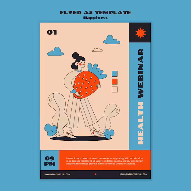
Posters With Purpose
Before you begin, you need to know what you’re designing the poster for. Ask yourself:
- What’s the goal of my poster?
- Where will it be displayed?
Answering these questions will set your illustration design on the right path. You don’t want your banner to defeat its own purpose.
Here’s a little guide to help you with it:
| Purpose | What the poster should do |
| Advertising | Make people curious about a new product. |
| Event promotion | Tell people about concerts, festivals, or exhibitions. |
| Campaign | Provide details about social causes. |
Don’t forget your end goal. Think of children’s educational posters in UK for an event on environmental issues. They’ve got bold fonts and some shades of maroon. Sounds odd, doesn’t it? This is exactly what you need to avoid, as it goes against your main aim.
- Who Are You Talking To?
This is a very obvious step. Communication always goes two ways. You can’t get your message across if you don’t know who’s on the other side.
Let’s say you’re making a poster for a professional event, but the illustrations are of cute animals. That wouldn’t be nice, right? Having a clear idea of your audience will help you decide on the right colours, illustration style, and other elements of the banner.
Get Inspired
You’ve got the purpose and audience figured out. Now what? You need an idea, or many ideas, to begin with. Inspiration is a very important part of the illustration process. Have a close look at posters with a similar purpose to yours. Pay attention to how they’re designed.
Keep track of your ideas. Gather them all in one place and brainstorm. Let your imagination go wild. Don’t worry about perfection; just focus on getting your inspirations in one place first.
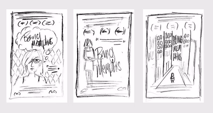
Sketch It Out
Start with an initial sketch. Plan out what will go where. Keep the overall layout in mind when you do this. You don’t want the illustration to overwhelm the appearance.
- Visual Hierarchy
The most important thing should be the easily visible. Set the size for each element depending on its significance.
- Free Space
Don’t overcrowd the design with everything you can think of. Make use of the white spaces for maximum impact.
- Text
Your poster must have a message. Plan out where it’ll be placed. If there’s a call-to-action, make it stand out.
Many jump straight to the designing process without getting any rough sketching done. But since you’re a beginner, it’s better if you sketch first. Start with thumbnails and keep changing things around until you’re satisfied with the results.
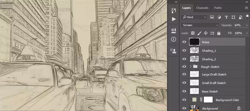
From Rough To Ready
Now you have a rough idea of exactly what you want to do with your illustration. The next step is to redraw it, but this time, with certainty. Make the shapes and text clearer. Remove any unwanted strokes and trace over all your rough lines.
Draw smooth and confident lines to outline your sketch. To add more depth, use different line thickness for more emphasis. Here are some digital tools you can use for this purpose:
- Canva
- Medibang
- Krita
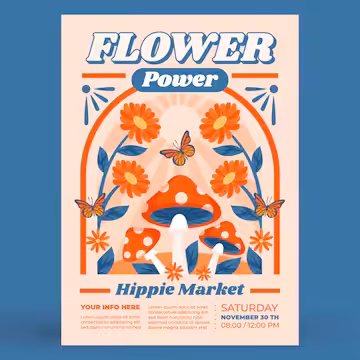
Say It With Colours
The black and white lines seem too boring. Add colours to it. The colour scheme will either make or break your banner. Your choice needs to align with the main purpose of the poster. They should create the right emotions in your audience.
Here’s a small guide to help you choose:
| Colors | What they’re linked to | Best Used for |
| Blue | Trust and loyalty | Educational poster Infromational poster |
| Green | Peace and energy | Banners for environmental causes |
| Red | Danger and courage | Sales announcement Concerts |
| Yellow | Happiness and warmth | Entertainment events School posters |
In case you’re working for a brand, remember the visual identity. Ensure that the colours closely align with the branding scheme.
Fonts Matter
Your poster must have some text on it. It could be a call to action or some information. Choose a font that is easy to read. You don’t want people to squint to understand your banner.
Consider your main goal when choosing the font. If you’re designing for a corporate event, you can’t use Comic Sans. Similarly, Roboto isn’t the best choice for a banner made for a launch event for illustrated children’s books in UK.
Finishing Touch
There you go! You’re done with the design! Take a step back and look at it from a distance. Pay attention to how all the elements come together. Think about how it’ll look from afar. Ask yourself:
- Is the text readable?
- Do colours go well together?
- Is there enough free space?
Get another pair of eyes to review your final design. A friend, fellow artist, or professional editor will help you improve your poster. Once you’re satisfied with the results, finalise it.
People Also Ask
What’s better? Digital or traditional tools?
It’s completely up to you! If you like the human touch of hand-drawn illustrations, use traditional methods. On the other hand, if you want to try a lot of different colours and layouts, go for digital tools. It’s all about what you’re comfortable with.
What mistakes should I avoid?
Don’t use too many fonts. Make sure they’re readable. Create enough free space to avoid overwhelming the overall layout. The message should be clear and visible.
How do I know when I should stop editing?
If you find yourself changing things around for the 6th time, pause. Ask yourself if the main goals have been met. If the answer’s yes, then save it right then!
Wrapping Up
Poster illustration process is difficult, but not impossible. You don’t have to be a pro to make impressive designs. Anyone with inspiration and passion can make banners that make heads turn.
Creating posters is about expression, not perfection. Make every stroke, every edit count. Start small; no one becomes a master artist from the very beginning. Follow these steps so you don’t feel lost during the journey. Take it one step at a time. Remember, as we all start from somewhere. Don’t forget to enjoy the process of turning your visions into reality.